And Now for Something Completely Different
This is mostly a science and tech blog, so it’s admittedly off-topic to have a post on fashion color trends. It’s a bit of a personal obsession for me, though, and I’ve come to trust that being too rigidly “on brand” is not actually the best policy. Invariably, the place where you post your “silly”, “random”, “personal” stuff is where you truly “live” mentally, while the official polished repositories end up barren.
So, fashion. And colors.
This whole thing grew out of my frustration with the Pantone Institute’s Color of the Year.
Every year, Pantone (the people who bring you the standardized color matching system used in all kinds of graphic design, product design, and fashion) comes out with a new color to represent the trends of the year.
And….it sucks.
Maybe I shouldn’t care, but I do. Color is something one could take seriously. One could, in principle, come up with a data-driven “color of the year”, based on actual frequency rates in some leading indicator of style: say, the annual runway collections at the major fashion shows.
Pantone doesn’t do that. They don’t give any methodology as to how they generate the Color of the Year. It might be completely arbitrary, and certainly sometimes they seem to be phoning it in. They released virtually identical Colors of the Year only a few years apart (2022’s Very Peri and 2018’s Ultra Violet), and sometimes there’s good evidence that their colors represent a lagging indicator, not a leading one, of trends in design.
In other words, the Pantone Color of the Year is not a useful tool for tracking the changing world of design and aesthetics; it’s a brand-awareness tactic, “for entertainment purposes only”… and therefore less actually entertaining.
It’s clearly possible to do “trendspotting” in a high-integrity, data-driven manner — Laura Wattenberg has been reporting on trends in baby names, for fun and curiosity, for more than a decade. She notices real patterns that show up starkly in the stats, such as the fact that baby names are getting more varied and eccentric over time, and that (for whatever reason) baby names have more vowels than they used to.
Most trendspotting is a lot more fake and boring than that.
But the real thing — making sense of how things change over time — has a certain addictive charm.
For a particular kind of person (which includes myself), trendspotting is a temptation.
If you’re an “infovore” with a systematic mind, if you like to collect and aggregate and organize information and data, but if maybe you’re not that original or creative yourself1, then you’ll gravitate to the kind of “research” or “writing” or “analysis” that’s essentially trendspotting.
Trendspotting in the broadest sense includes what I do with my regular, more sciencey posts: aggregating information about work that other people do.
I see it as a temptation because being an information aggregator is easier than being a creator. When your “work” is aggregating information, you get the exhilaration of feeling that you’ve been granted an aerial view, that you can see the whole of “what’s going on”, the “big picture.” It can give you the insidious sense that that you’re “above” the object-level toilers who spend their whole lives creating only one of the elements you file in your collection.
And info aggregation comes with its own peculiar anxieties — the anxiety of clouded vision (what if there’s important data where I can’t see it? What if the online world is too fragmented and the epistemic commons too poisoned for anyone to make sense of things? what if I’m out of touch with the younger generation?) and the anxiety of social epistemology (what if the Thing Everyone is Doing Now sucks? what if there is no contingent or community doing the things I want to see done?)
These anxieties worry all writers about culture, who are essentially trendspotters in fancy dress. To be a cultural observer is to continually worry that the zeitgeist has shifted in some unfavorable way, or that the world has truly gotten too hard to understand. These seem like universal problems to writers, but of course they are specific to the trendspotting profession (or hobby).
For someone whose focus is more heads-down and local — my family, my hobbies, my object-level work — it doesn’t matter if there’s parts of the “world” you can’t see or don’t like. You don’t have to pay attention to the whole “world.” You’re cultivating your own garden. It doesn’t matter if “everyone” is doing something dumb; you don’t have to.2
In fact, nobody ever really was able to understand “the world” in full from their laptop, and “the zeitgeist” never really referred to everyone; at best, it’s possible for a social milieu to feel big enough and important enough that you can refer to it as “the world” with a straight face.
Venkat Rao has some nice writing about this — he’s unusually self-aware about the limits of the cultural-observer approach, but he still is one, ultimately, and he thinks that despite every writer’s tendency to define “the world” by their own preconceptions, there actually is a real intersubjective phenomenon about “the world getting worse and more confusing,” and it’s a serious problem. In some lights and moods, I’m inclined to think he’s right. At other times, I take it as a warning not to get too obsessed with documenting “the world” at the expense of living my own life.
A similar and heavily overlapping activity to trendspotting is trend-seeding, trying to make something a new trend. Much putative “trendspotting” analysis is actually a normative attempt to declare a (desired) trend into existence.
Conversely, all trend-seeders have to do at least a little trend-spotting. When you try to “make a trend happen”, you’re implicitly betting that it’s culturally viable; there’s a descriptive assessment of the zeitgeist involved.
Manifestos are explicit trend-seeding and covert trendspotting; journalistic “trend pieces” are explicit trendspotting and covert trend-seeding.
And while trend-seeding seemingly allows you to be an agent rather than an observer in the social world, the line is inherently blurry. You can only influence society in the directions it “wants” to be influenced, so supposed agents are more passive than they appear; conversely, supposedly neutral observers of the world have more influence than they admit.
I’ve done a bit of manifesto-writing, and it’s reliably popular, but I usually regret it. Being rhetorically effective is a neat trick, but it’s a long way from being practically effective, and these days I think information is a more powerful lever on the world than rhetoric. Much as I’d like to be able to “manifest” the world of my dreams into existence, a broad call to action has a way of…not leading to action. I believe there’s power in showing the world possibilities, which is not quite the same thing as expressing wishes and exhortations.
At any rate, all that is to say: fashion and color is not gonna change the world, but it is a way of looking at things. It’s a benign exercise for the trendspotting instinct that I think is far too often toxic. It’s not “serious”, but it’s going on the blog anyway. And maybe I’ll indulge in a little hyperstition in the process.
Methodology
Runway fashion, for the uninitiated, follows a calendar. In the fall, designers show the spring/summer clothes on runways (so stores can buy them in time for the upcoming season.) The fall/winter shows are in the spring.
Vogue Magazine generously provides high-quality runway photos of lots of collections, from shows around the world. (Paris Fashion Week, London Fashion Week, New York Fashion Week, and Milan Fashion Week are the famous ones, but a lot of other countries host smaller shows, sometimes off the regular calendar.)
For my color trend analysis, I just use the ready-to-wear spring/summer and fall/winter collections.
Ready-to-wear means you can buy the clothes in a store. Couture fashion is custom-made, more expensive, and often more fanciful; couture includes some high-concept “wearable art” that barely looks like clothing at all, as well as the elaborate special-event gowns you might see at red-carpet occasions like the Oscars.
Even just restricting attention to ready-to-wear collections on the Vogue website, each season has hundreds of designer collections, and each collection might have anywhere from 10 to over 100 “looks” (each look is one model wearing an outfit.)
To quantify colors, I make a list of color names, excluding neutrals (black, white, gray, brown, beige, navy) because otherwise neutrals would obviously predominate every season.
Colors are mutually exclusive (if something is forest green it can’t be hunter green — they’re both dark greens but IMO forest is a notch yellower and hunter a notch bluer).
And then I just count, manually, how many “looks” each color appears in.
An outfit or garment that contains elements of multiple colors contributes to the “count” of all the colors that appear in it.
I count only outfit elements that are plausibly part of the collection — so, accessories like bags and shoes count, but flowers and other props don’t, and neither does makeup or hair color.
Digression: Why Do This Manually?
Well, the real reason is that I like counting and I’m too lazy to write code.
But also, let’s think for a minute about what it would take to automate the process.
If you wanted to automatically “score” an image by color, first you’d have to segment it so you know which pixels refer to the garments/accessories from the collection (rather than the model’s body or the image background).
Some segmentation is ambiguous and would probably have to be adjusted manually anyway — a teddy-bear-shaped purse counts as an accessory but a teddy bear is just a prop, and I wouldn’t count on being able to easily train a model to tell the difference.
Then you’d have to score the color, and that itself is a hard problem.
Color, of course, depends on lighting.
A photo of a monochrome dress will contain pixels of many colors, simply because some regions are in light and some are in shadow. But we don’t want to score it as containing hundreds of colors.
You can approximately solve that problem with clustering algorithms. You simply lump “nearby” colors (in color space) together, and choose the “number of colors” to be small enough that a solid-color red dress will always appear to be “one color.”
Even that will have edge cases, though. A solid-colored garment with lots of pleating or draping, or with dramatic spotlight lighting, will have some very dark and some very light parts, and we want that to be scored as “one color” — but if the garment has a printed pattern of two nearby colors of red, we probably want that to be “two colors.” And yet again, if the garment has textural variation, like a jacquard material with a raised pattern but only one color of dye, we want it to count as one color…even if we’d score it as two colors if that pattern were printed rather than woven. In other words, there’s nuance and context that depends on interpretation and knowledge of how clothing and fabric work. Vanilla computer vision methods are not going to cut it.
The even harder problem is disambiguating between lighting effects and the “real” pigmentation of the clothing.
This is actually an unsolvable problem in general. It’s an example of an inverse problem — given an image, what light sources and what pigment colors combined to produce it? Well, it’s underdetermined. Multiple pairs of (light sources, pigmented objects) could yield the same photograph.
That’s what’s going on with the famous “Dressgate” viral phenomenon. It’s ambiguous whether the dress is “really” white-and-gold or blue-and-black — the same pixel colors could have come from a white-and-gold dress with blue-tinted illumination or a blue-and-black dress with yellow-tinted illumination.
Human color perception aims for color constancy, aka recognizing a “truly” blue dress as blue no matter the color of the light illuminating it. We try to use context clues to infer the color of the illuminating light, and then discount it (throw it away) to “see” the colors of objects as they would be under “white” light.
But, once again, it takes a bunch of contextual cues to infer the illumination color, including knowledge of the world (eg we know that candlelight tends to be yellow-orange). And some photos, like the famous dress pic, don’t have enough contextual information for even humans to reliably guess the true illumination color.
So, while it’s not impossible to come up with an algorithm to automatically score fashion show looks by color, it’s nontrivial, and I expect even at best there would be a lot of edge cases where my subjective judgment wouldn’t agree with the algorithm.
But wait. It’s 2023. Couldn’t you just…ask ChatGPT to do it for you?
A couple of quick spot checks say yes.
Using the prompt “give a bulleted list of the colors present in this outfit”, I seem to get reasonable results. It’s not great at fine distinctions (slate blue vs. cyan etc) but I’d expect about the same degree of disagreement if I delegated color scoring to another person.
Everything I’ve said about color-scoring being a hard problem with inherent ambiguity is still true3 and ChatGPT gives noisy results on “hard cases” — but suddenly the problem has gone from “it’s not worth automating at all, it’s too hard to code, guess I’ll do it by hand” to “well, a good-enough solution is right there, maybe that suffices for what I care about.”
It still boggles me what big multimodal models like ChatGPT can do. I’m used to neural nets c. 2018, where you’d have to train a model painstakingly for each individual task and you’d still get garbage on your first couple tries. I’m used to anything to do with image processing failing on stuff you’d expect to be “easy.” I am not used to “push a button, get a basically-correct answer to a totally new question about a totally new image.”
So yeah. Maybe next season I will automate it after all.
The Colors
Let’s go back in time, shall we?
For this post I’ll just look at spring/summer (SS) collections for the past few years, to make apples-to-apples comparisons.
SS22 was a riot of warm tropical colors, in full-blown post-pandemic party mode. Bright oranges, yellows, pinks, and reds led the pack.
By SS23, while a classic true red was still on top, the palette had clearly shifted. Cool pastels, especially light blues, had moved up the ranks, while the bright oranges and pinks and some of the yellows had moved down. We’d shifted from flaming tropical-fruit colors to calmer seashell-and-sky colors.
Remember that SS22 came out in fall 2021, right around the time when the COVID-19 vaccines were approved and people started emerging from lockdown; SS23 came out in fall 2022, the year the pandemic largely eased, while the war in Ukraine began. The economy was marked by inflation, rising interest rates, and a crypto crash.
With a little magical thinking, you can see it in the colors of the collections — a retreat from wild euphoria towards caution and calm. Peaceful blues as an attempted antidote to war.
By the 2024 collections, pastel blue and pink are topping the list. "Classic” or “timeless” colors (basic reds, the indigo of denim, an almost-neutral peach) are also near the top.
And then, in the middle of the pack, you get what I think of as a “preppy” palette of clean cool pastels (peach, spring green, sky blue, bubblegum pink) and sporty brights (kelly green, lemon, sunny yellow). Picnic colors.
Overall, this is a continuation and deepening of the turn towards conservatism and restraint that started last year. “Restraint” is relative, of course — there are still lots of gaudy and playful clothes out there — but compared to 2022, it’s a striking shift. And it’s echoed by a lot of the fashion buzzwords of this season — “quiet luxury”, “real clothes”, etc. Fashion designers write about how “everybody’s doing ‘normal’ clothes again”. Colors have retreated to plain black and white, the financially safer choice for cautious designers and shoppers in a shaky economy.
Also, the palette is getting cooler. Oranges are moving down the ranks, and hot pink and fuchsia are gone altogether, as are warm yellows like goldenrod. Instead, we’re seeing more crisp greens and light blues.
Picking on Pantone
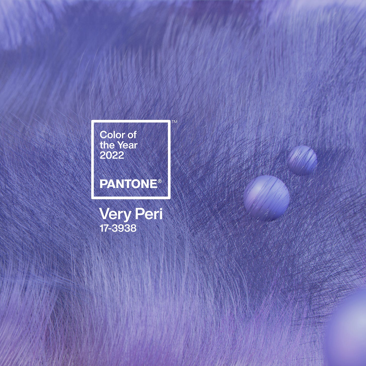
The 2022 color of the year was Very Peri, a cool, rather deep shade of lavender that was nowhere in the 2022 collections.
The copy alludes to “trends in gaming, the expanding popularity of the metaverse and rising artistic community in the digital space” as inspirations for the hue, which seems to be exactly wrong about predicting the near future.
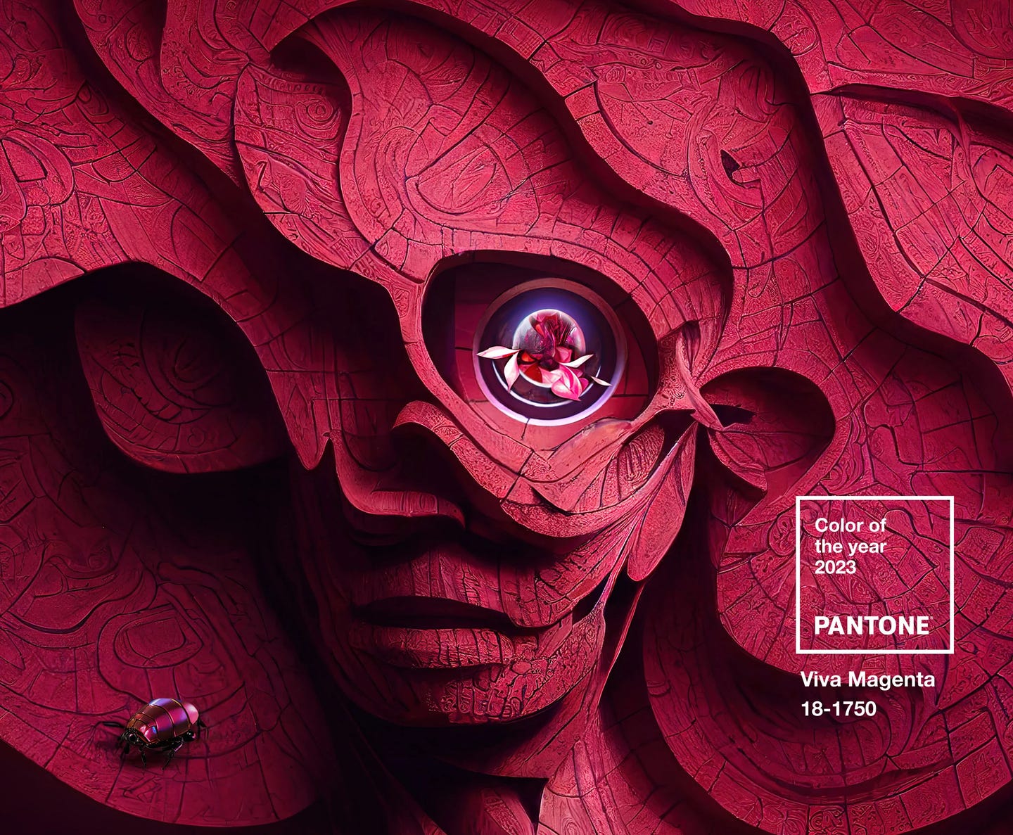
In 2023, the color of the year was Viva Magenta, a cool, intense pinkish-red inspired by the cochineal beetle (which feeds on the prickly pear cactus and makes a dye of the same brilliant color.)
While I do love this color, again, I didn’t see anything close to it prominently in fashion at all…since 2021. And the neon-hued glow-party illustrations that accompany the release look, frankly, dated. (That sort of thing felt delightful and fresh around 2012; by 2016 it was showing up in Moana.) Maybe Pantone is just a lagging indicator?
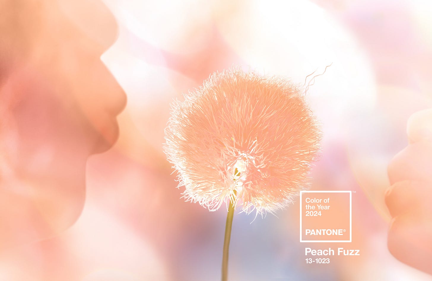
To be fair, though, I think Pantone’s color of the year 2024 is right on the money:
“Peach Fuzz”, a rather melon-y shade of peach, is supposed to evoke “kindness and tenderness”, “sharing and caring.”
And, indeed, peach is newly prominent in the SS24 fashion collections, after years of total absence. And Pantone’s color associations are absolutely right, in my book — peach is a soft, tender, warm color, reminiscent of (some) human skin, entirely in line with a retreat from a harsh and chaotic outer world into a comforting cocoon.
My Color-of-the-Year Picks
Here’s my alternative picks for the “color of the year” — and reflections on trends, vibes, and themes.
2022: Tangerine
For 2022, I would pick a vivid, citrusy shade of orange.
The most common color in the SS22 collections was a basic “true red”, but red is a perennial chart-topper and we wouldn’t want the color of the year to be the same forever, so I’m going with the #2 color, tangerine.
Tangerine is a notch yellower than “true” orange, and thus has an even sharper, more energetic effect. It evokes exuberant playfulness.
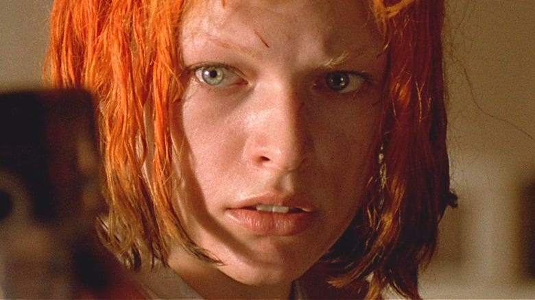
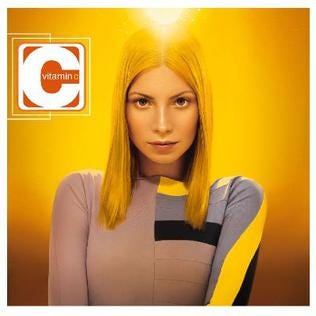
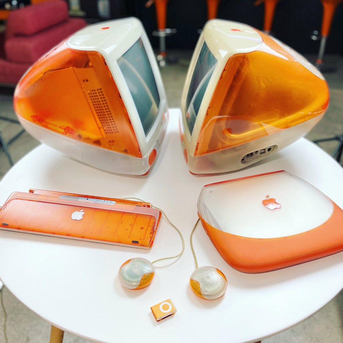
Especially in minimalist or neutral contexts, a pop of tangerine is reminiscent of the “futuristic” aesthetics of the early 2000s (think of Leeloo’s hair in The Fifth Element, Vitamin C’s debut album, or candy-colored iMacs) so it fits in well with the neo-Y2K trend we’ve been in for the past several years.
And, while we’re doing zeitgeist dreams, tangerine is eminently appropriate for a “world” emerging from a pandemic and ready to start living again. It’s a party color, a fun color.4
My own 2022 was certainly “vibrant” — I had a baby and started this blog. There was, indeed, a sense of life “starting up again”.
In my corner of the internet, the “vibe” had clearly shifted. The “world” was becoming obsessed with Facts: supply chains, wars, industrial policy. People around me wanted to be Serious Men Of The World, like 1950s statesmen-industrialists.
A redder “flame orange” (close to the “tomato” that’s the #3 color in 2022) seems to be the unofficial color of the new crop of defense/hardware startups touting their American Dynamism:


Vivid orange is also the color of traffic cones and warning lights — the color of construction. And the color of fire. It’s a bold, aggressive color, suitable for a confident (and rather martial) era.
It’s not a naturally congenial mode for me, so to some extent I’m being dragged into the 2020’s kicking and screaming, but I’ve been adjusting. I’ve oriented my writing and market positioning more towards Facts and Progress because of the new zeitgeist (not that I don’t sincerely see value in both facts and progress).
2023: Sky Blue
For 2023, while red continued to top the chart, and pastel pink and lemon yellow were also ranked high, there was a distinct cluster of light blues near the top — powder blue, chambray, sky blue, and cyan. Splitting the difference between them (cyan is brighter and warmer, chambray more grayed and muted, powder blue paler and cooler) I would put the “center of gravity” around sky blue — a light, clear blue, a smidge warm-of-center.
Fashion trend reports going into 2023 noted that the industry had “one eye on recession” and pointed to clothes becoming more “normal” and “muted” rather than flashy.
Sky blue evokes calm, spaciousness, airiness, and peace. It’s hopeful but not brash. It’s airy — remote, refined, delicate.
Sky blue is the ultimate in “far mode”, the way we think about distant abstract ideal things like the future, as opposed to “near mode”, the way we think about nearby concrete messy things like the here-and-now. We imagine the future as blue (and silver, another 2023 trend) because the future is far and so is the sky. (Or, blue stands for the bluish tinge of atmospheric perspective.) It’s not weighed down or mussed up by workaday details — it floats.
Sky blue can represent a retreat from a “hot” economy into a more cautious one.
It can also represent the moment when the futuristic, abstracted, idealized world of AI began to reach the general public, with the November 2022 debut of ChatGPT.
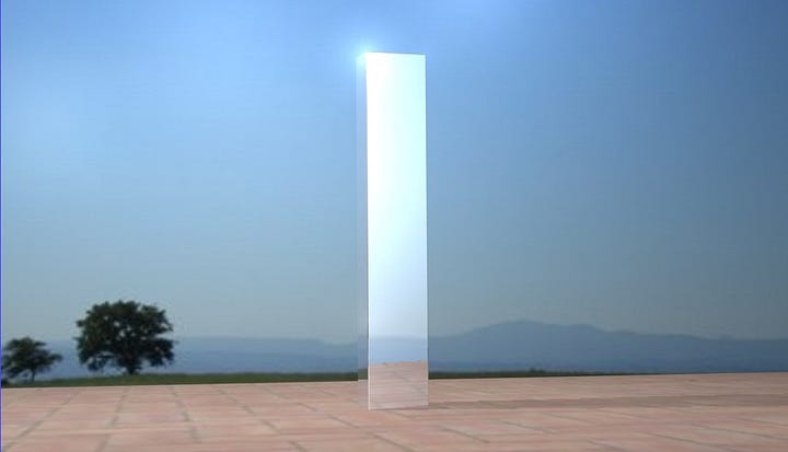
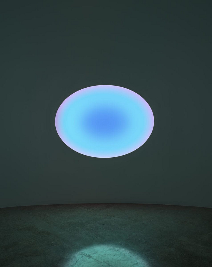
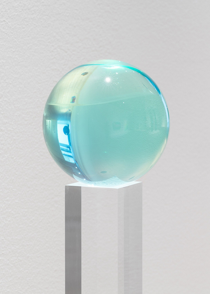
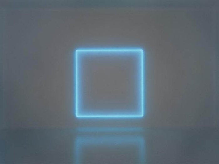
A good deal of what constitutes the “futuristic” aesthetic today comes from the California Light and Space Movement of the 1960s, when artists used the techniques and materials of the then-booming aerospace industry of southern California to create abstract sculptures that evoked the sea and sky of the Pacific.
And we’ve been seeing something of a revival of interest in Light and Space in recent years, with new retrospective shows centering the women of the movement like Helen Pashgian and Mary Corse.
2023 was also the first year I gave myself a yearly “theme” for the upcoming year, inspired by the color. My theme was “spaciousness” — basically a goal of finding more calm, and making time for top priorities. Overall I think it was surprisingly successful — like a lot of personal-growth stuff it’s pretty squishy/subjective, but I’m finally feeling overall pretty content with most parts of my life most of the time.
2024: Spring Green
While peach is a perfectly fine choice for a 2024 color of the year, I think spring green is an equally valid alternative to Pantone’s theme.
The economic stats in the US may not be bad overall, but rising interest rates mean that times feel tougher for elite tastemakers. The “money people” are leaning harder on creatives to rein in the crazy stuff and deliver actual profits.
Meanwhile, the world news is terrible — war in Ukraine and Israel, not to mention the slow-burn escalation of tensions between the US and China.
And that anxiety shows up in slightly more subdued, conservative fashion trends, and “quieter” colors — including pastels.
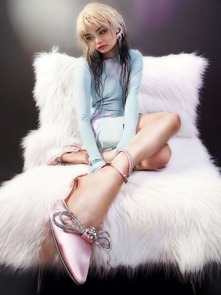
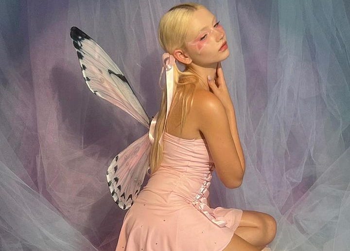
Pastels are calming, comforting “self-care” colors; they can also read as ladylike, delicate, innocent. A retreat to safety.
Pastel blue and pink have been big for a few years now, but this year they’re also joined by peach and a light spring green.
Spring green, of course, evokes springtime — newness, freshness, youth.
It’s a little more striking than other pastels. Pale pink or baby blue might be a default, but spring green is a choice.
Spring green fits in with a kind of “dorky-cute” aesthetic I’ve seen here and there in recent years: a little Y2K-inspired, a little crafty, a little eclectic.
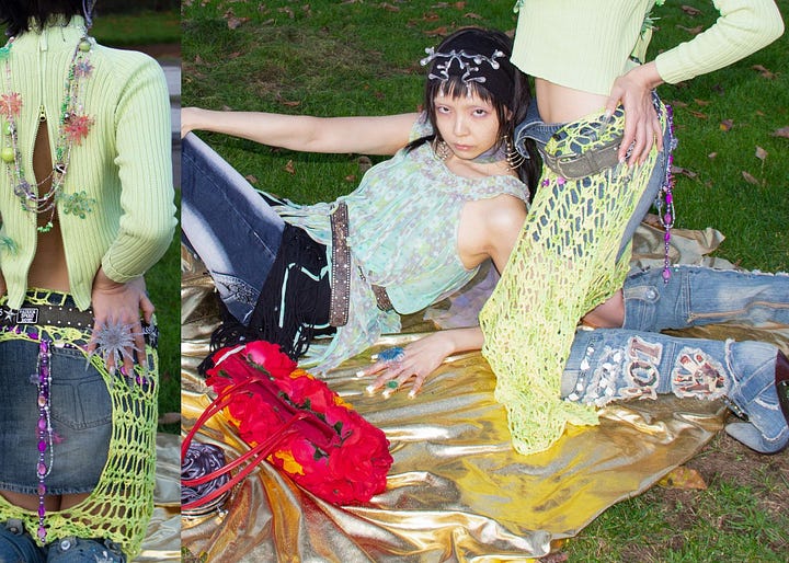


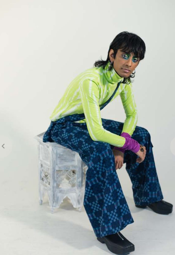
This is the playfulness and “mess” of a child playing dress-up.
Spring green is almost — but not quite — lime, or neon, or chartreuse. It’s on the border between delicate freshness and aggressive acid brightness.
If peach is a pure inward-looking “cocoon” color, spring green is a little higher-energy; it’s ready to come out to play.
I have a sense of things “stirring” in the world these days. I’m more often in a mode of “poking my head out from under my rock” to see what’s going on. Chaos and turmoil aren’t slowing down any, of course, and different people’s worlds are still diverging rapidly. But there’s a little flavor of “oh, that’s interesting and fresh” or “wow that’s come a long way since I last poked my head in.”
So that’s going to be my personal 2024 theme of the year: “freshness.” What’s newly possible that always seemed inaccessible before? What can I do that’s not the same old rut? What’s genuinely fresh, playful, alive?
for the woo-inclined, this is what I think of as “Virgo stuff.” Earth Mercury, the “mundane” or “concrete” aspect (Earth) of the intellectual/verbal (Mercury); libraries, record-keeping, spreadsheets, maps, etc.
Sam Kriss was moved to write this incredibly depressing, disgust-ridden essay after seeing Ant-Man and the Wasp — I find it almost unbearable to read anything so negative — but it also never would have occurred to me to actually go see that movie.
amusingly, ChatGPT lists the colors in The Dress as “black, blue, white, gold”, which is clearly wrong by either interpretation but maybe an ok way to split the difference.
Of course, post-pandemic parties weren’t a part of everyone’s life — they weren’t part of mine — but wild and adventurous party outfits were certainly a thing for the elite segment of society that buys designer clothes. Which is no worse a definition of the “world” than many others.





“We imagine the future as blue (and silver, another 2023 trend) because the future is far and so is the sky.”
Also, maybe, redshift of the past receding into the distance; blueshift of the future rushing towards us...
Excellent writing. Enjoy your perspective on colors and the feeling they might suggest.
Colors are beautiful should be important. I enjoy numbers and how they can explain reality, or compress something complicated into something more easily understood.
Numbers expressed in graphs or charts can truly take understanding to the next level of utility. BUT, use the wrong color or lazy color selection in the visual and "Gross, get that thing away from me!"
Use the right color and... it can approach Art or Style or Good Taste. 🤩🙏🏽