Once again, I’ve compiled some statistics on color trends in the spring/summer 2025 ready-to-wear fashion collections!
Background and Methodology
We just got done with “fashion month”, the flurry of activity in the fall when fashion designers release their spring/summer collections for the coming year and display them on runways in New York, London, Milan, and Paris.1
Vogue Magazine generously shares many images from the collections — by my count, 13,570 photographs in all, typically each of a different outfit.2
My question is a simple one: which colors are most common in the SS253 collections in aggregate? And how do they compare to previous years? Are there changing trends in color popularity?
There’s an obvious and boring answer: the most popular color in clothing is always black. Followed by white. But things get more interesting as we go further down the list.
I use two methods for doing color stats: manual and automated.
The manual color stats are literally me counting the frequency of colors by eye. Each “look” or outfit that a color appears in, counts for one, whether the color is an accent, accessory, or the main color of a garment. Because this is time-intensive, I only count non-neutral colors manually; no black, white, grays, browns, beiges, etc.
The automated color stats are done with a script requesting GPT-4o to make a list of the “specific colors present in this image” for all the images.
Both human error and machine error are real possibilities here, plus “matters of taste” where I disagree with the AI but might also disagree with another human.4 So it seems like including both scoring methods is best, just to be sure.
Results
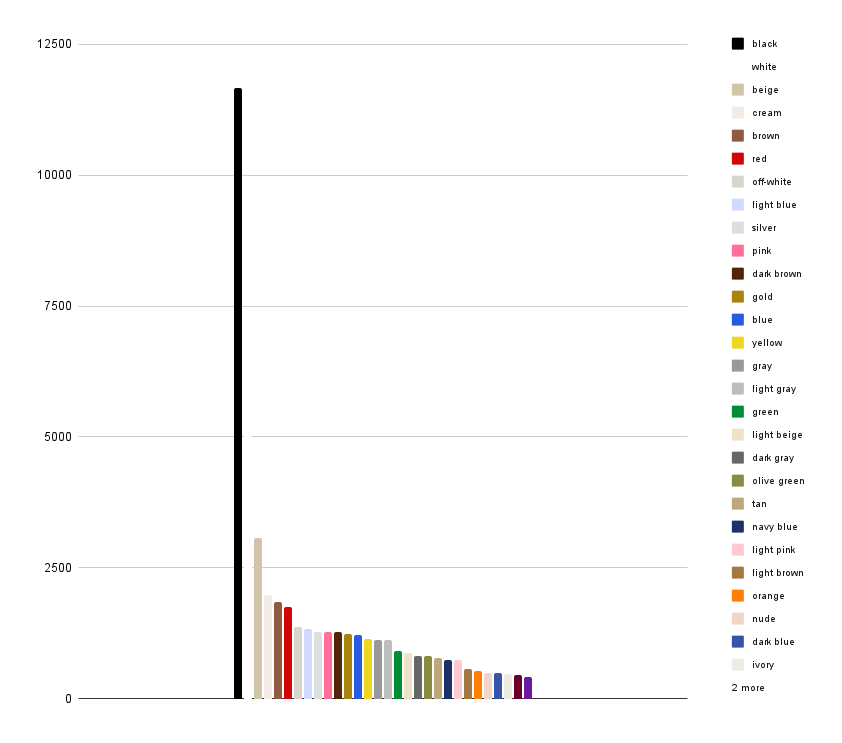
Here’s the full GPT-4o automated results:
Unsurprisingly, black and white top the list, along with some other neutrals; red, a perennial favorite, is the top non-neutral color.
If we just look at non-neutrals, we see a bold palette of mostly basic brights in the lead: red, pink, blue, yellow, green, orange, etc.
And if we look at manual scoring, there’s a fairly similar effect: red in the lead (of course), with other bold basic colors (bright yellows, royal blue, hot pink) close behind, as well as some pastels.
Where this gets more interesting is when you compare to collections in previous years.
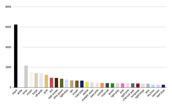

Last year, the top colors after black & white were an unbroken smear of pale neutrals and metallics — silver, cream, beige, off-white, and gold. This year, the metallics have gone farther down the list, and darker browns are way up.
Also, we’re just seeing more color in general. Near-neutrals like olive green have moved down the list; blue has moved up.
If you look at non-neutral colors (again, in the automated stats) you see changes in which colors make it into the top thirty:
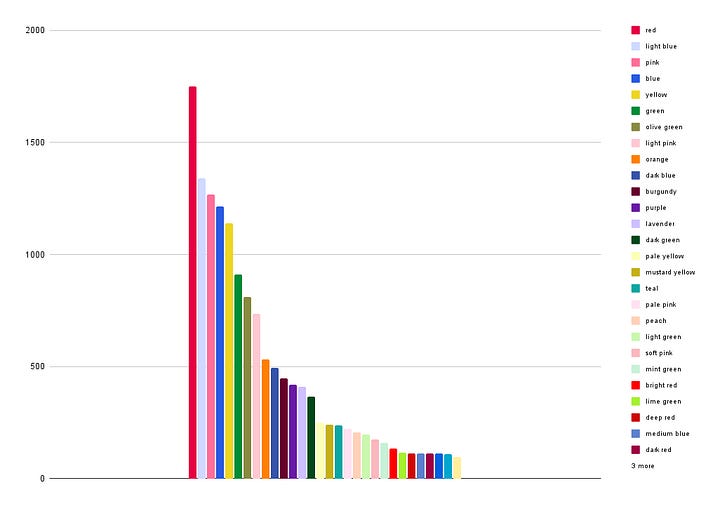

bolder blues (blue, medium blue, and turquoise) are newly in; muted, dark colors like burnt orange, maroon, mauve, and forest green are out.
Looking at the manual scoring, we see most strikingly that hot pink and royal blue are more prominent than they’ve been in years:


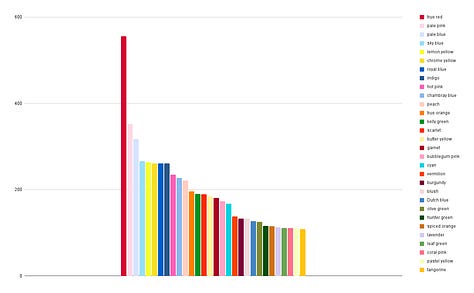
And this is pretty consonant with the theme echoed by Vogue’s coverage of a return to “bold” fashion after a few years of retreat into subdued “quiet luxury.” Mostly that “weirdness” has taken the form of unusual shapes (hoop skirts! bullet bras! bulgy pants!) but we also see bright primary colors and hot pink coming back for 2025, while basic near-neutrals (olive green, the indigo of denim) and pastels move back down the list.
The “quietness” of fashion, over the past few years, was a reaction to a slowdown in luxury goods sales since the post-pandemic buying boom:5
Economic “bad times” — the 2000 and 2008 market crashes and the 2020 pandemic — show up as decreased luxury good spending, and economic uncertainty, like our current period, tends to show up as a slowdown in growth.
While the forecasts for fashion revenues are still pretty weak, it seems that designers are tired of playing it safe with “normal clothes”. Certainly, commentators have been lamenting their boredom with basics and have been enthusiastic about signs of a return of eccentric, opinionated fashion.6 If boldness is back, it’s not an economic trend but a cultural one.
My Pick For 2025 Color Of The Year: Hot Pink
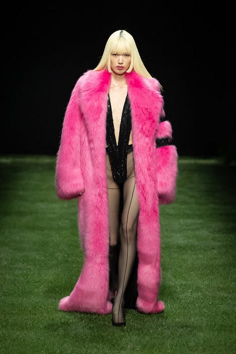
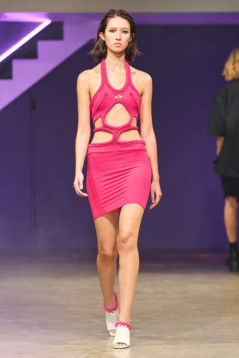
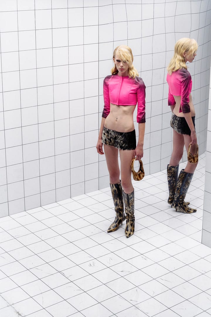
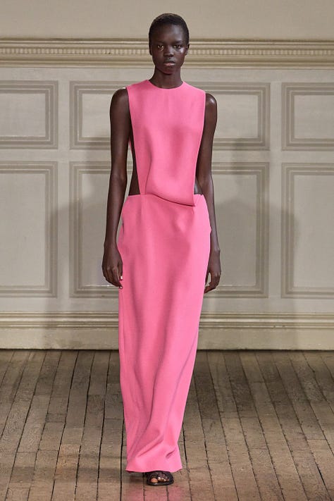
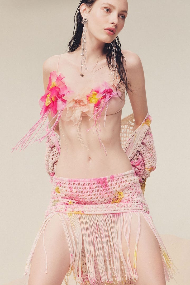
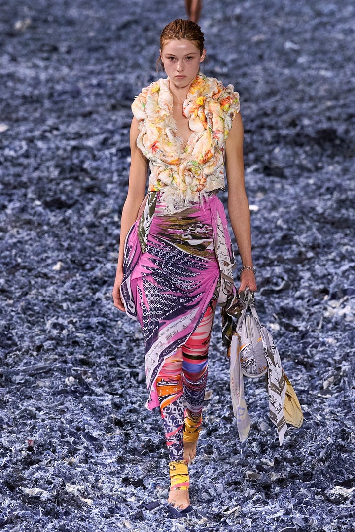
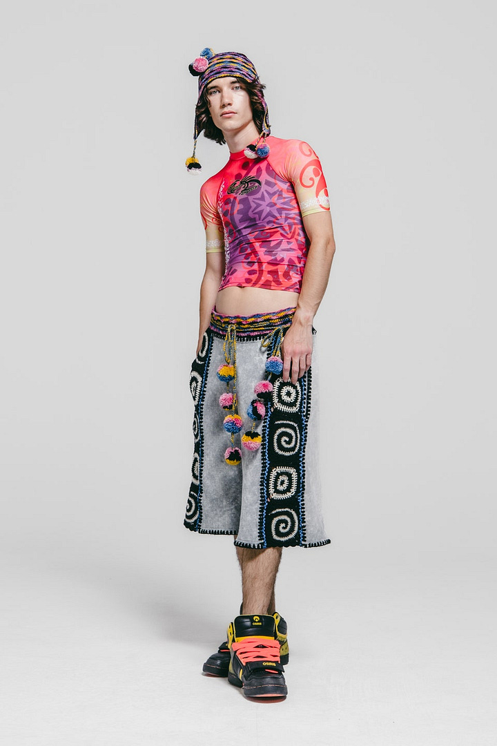
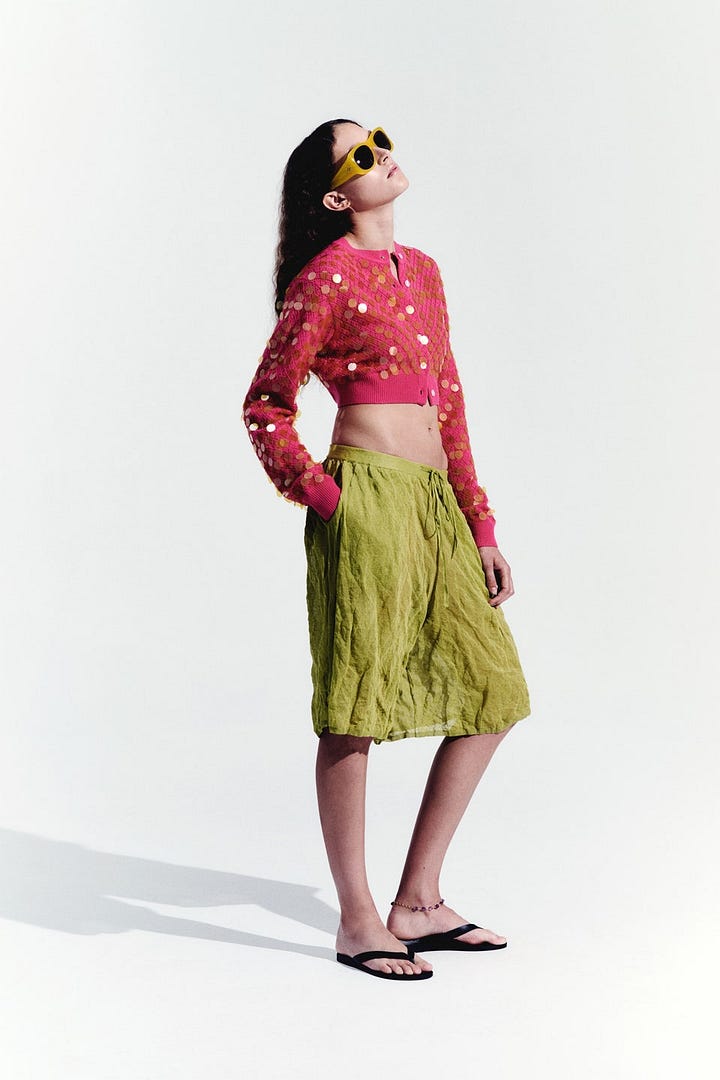
The most strikingly characteristic color of this year, I think, is hot pink. I also considered royal blue, or true yellow, but I’m going with pink.
In its 2025 incarnation, this is a bright, rather warm pink, edging towards coral or flamingo. Definitely not fuchsia or magenta, which are darker and purpler.
Hot pink, in our culture, clearly represents loud, fun, party-girl femininity.
It’s wild. It’s unabashedly frivolous. It has no purpose but a raucous good time.
In the SS25 collections, we see it, unsurprisingly, in skin-baring clubwear:

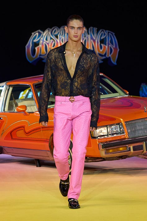



but also in more classically graceful gowns and tailoring:
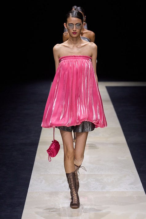
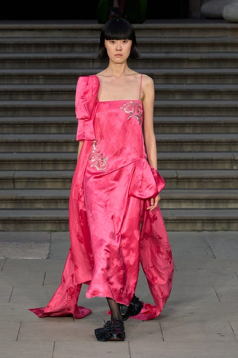
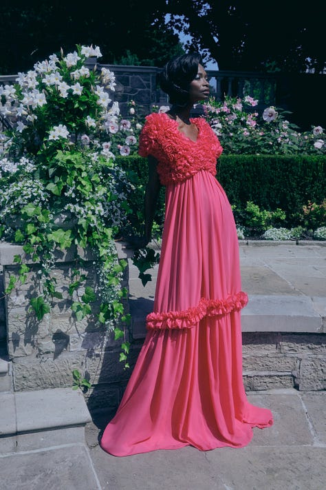
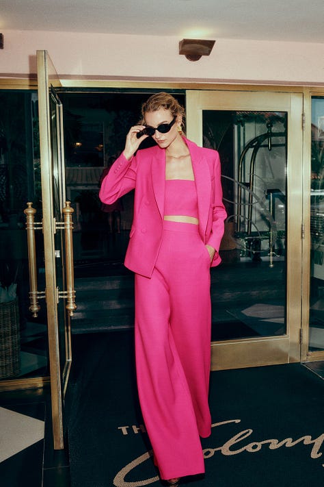
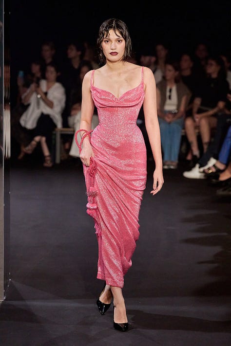
in slightly kooky and unhinged references to early-60s femininity:
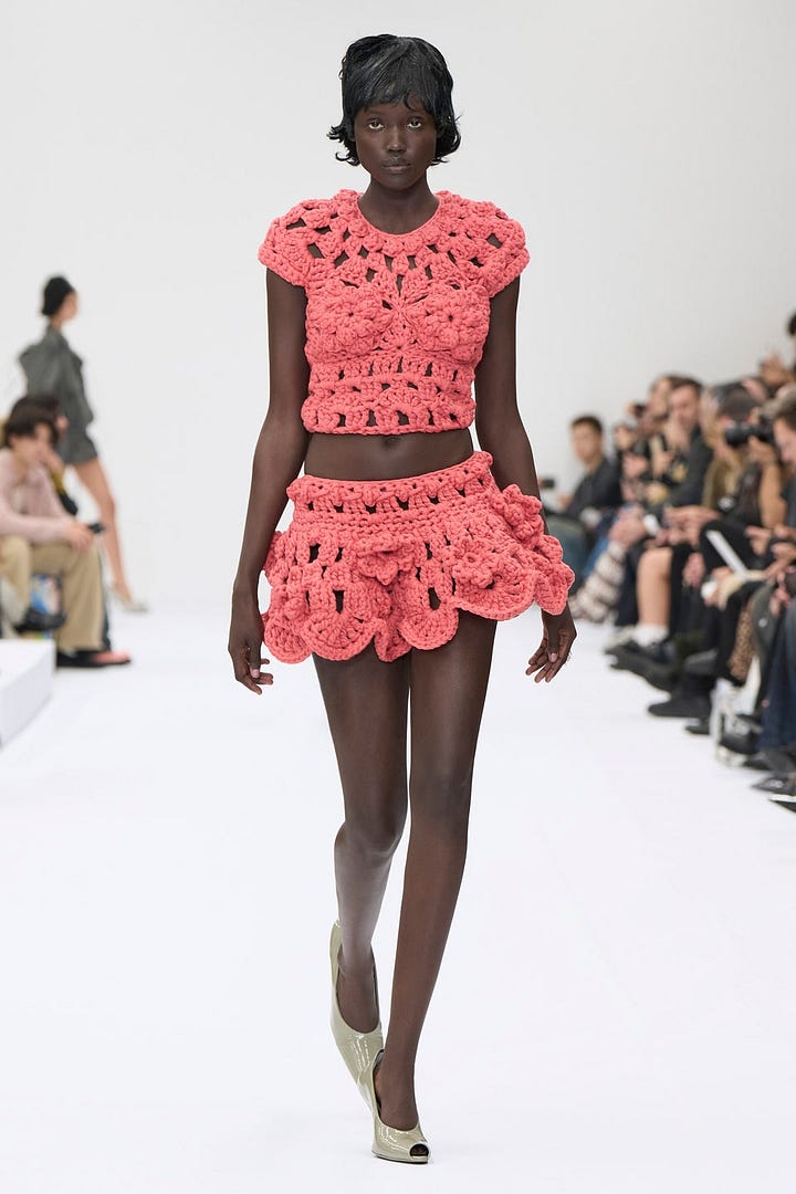
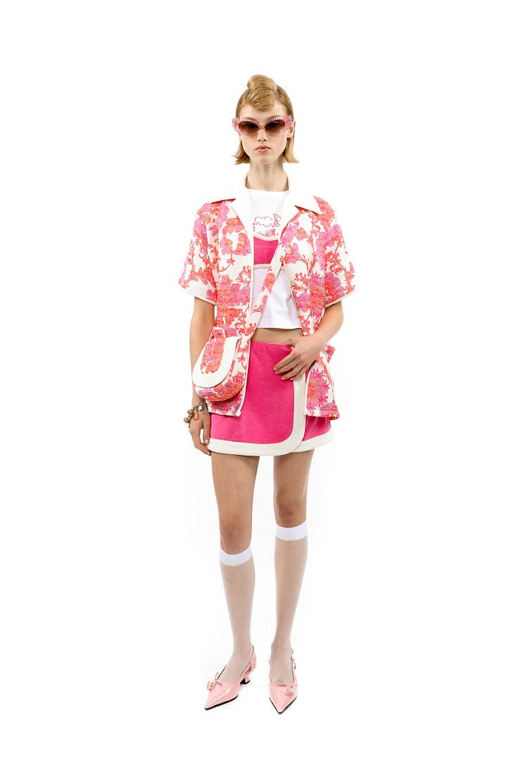
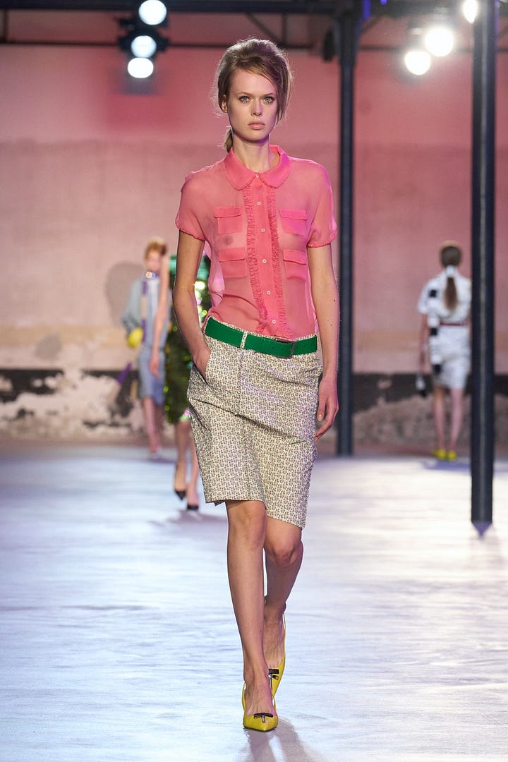

and in more eclectic, playful styles:
As always in this century, the mood of tastemakers tends towards gloom — the world looks grim when you make your living by getting attention at mass scale, given the cynical calculations that go into appealing to the marginal eyeball. When I read about fashion, it’s hard to shake the feeling that these people are not having very much fun.
But they want to be.
(And, despite my decidedly unfashionable lifestyle, I want to be).
Hot pink is the color of fun. To some degree, it’s the ironic, crazed sort of fun that feels right when the world is burning. Analogous to the “frantic” sped-up jazz of the 1920s, the soundtrack for a world overwhelmed by change — or leaning into it.
Pink and Progress
I’ve been thinking about “progress” in the sense of Progress Studies lately, as I’m wrapping up the fellowship and leading into the conference. A common lament is that the “progress community” is very masculine — both in the sense that women are underrepresented among enthusiasts of markets and technology, and perhaps also in the sense that there may be something inherently “masculine” in the gung-ho, relentless, aggressive vibe of “progress” as a concept itself.
Certainly, in one sense that sort of essentialism is nonsense, since Virginia Postrel’s “The Future and its Enemies” back in 1999 came up with the “dynamism vs. stasis” frame long before the current “movement” came along. Of course ideas don’t literally match up to gender in any absolute way, and anybody can hold any view.
But, thinking analogically and archetypally, the idea of “progress” is not just change, but change in a steady forward direction. It suggests a straight line, with no wiggles. Linear thinking, definite planning, absolute determination.
If “masculine” is too fraught a word, let’s say this spirit is “martial.” It is the energy that wants to charge and fight and do. To blast through resistance. To Achieve Goals. To Level Up.
It has value. But it is unnatural, for many of us, including me, to stay in this mode too long. What if we get tired? What if we get bored and want to go some other direction? Why do we have to Achieve Serious Goals and not play around?
Also, why is “forward” the only good direction? What about “backward” (reconsidering, changing your mind, regretting) or “staying put” (maintaining, supporting)?
“Dynamism”, by contrast, implies change but not necessarily steadiness. It suggests chaos, turbulence, explosion. Which seems a better fit to how I view the future than “optimism” or “progress”; things could go in all directions, good or bad, but there’s a certain beauty in the vigor of the flux.
Fashion is dynamic, but it does not make progress. It’s the paradigmatic example of something that changes for no good reason, just to provide variety and to allow tastemakers and early adopters to show off their wealth and status. It is pure luxury, pure optionality. Its fluctuations aren’t moving towards any goal.
The underlying technology of fashion — fabrics, dyes, etc — does make progress, enabling new possibilities at lower cost every year. But “the fashionable” itself is not going in any steady direction; it just changes.
This is the usual duality. We get materially richer by doing something like “chasing straight lines” — finding opportunities and pursuing them, pursuing profit or “making progress” on some other evidently useful goal, investing in future surplus — and then we can “waste” that surplus lavishly, on luxury and play.
A particular flavor of femininity — the hot-pink flavor — is all about the playful, fun exploitation of surplus, as opposed to its production or preservation. It’s much despised as “shallow” or “hedonistic”. Despite all the haters, I kind of love it.
They say we “should” plan for the future, provide for the future, restrain our impulses. They have said it since Pericles.
But…what if…not?
Put it this way. It’s not that I don’t root for material abundance, or think about making “progress” on some necessary component of it. But when we start doing bigger-picture culture-shaping stuff, there start to be critiques like “what’s it all for? AI-generated pictures of vintage 1950s shiny cities in space? what’s the reward, the object-level Good Thing about all this Progress? I find myself underwhelmed by the vision of the so-called visionaries. It’s just not a beautiful or fun picture being painted. In fact, there’s barely any picture being painted at all.”
A certain “dryness” starts to take over, when it’s all Facts and Things and Straight Lines and no screwing around.
And when there is a picture being painted, it’s only one kind of picture — Epic Heroism, charging nobly Forward. Or, adjacently, Wise Conservatism, nobly holding the reins of the passions.7
I maintain that people also need the wacky, the weepy, the bratty, the dreamy… a range of moods and visions, including those which cannot be viewed as “noble”. Maybe this is relativism, of a sort, or anti-normativity; so be it. I cannot always be “holding it in” or “pushing it forward”; sometimes it’s time to flop, twirl, or smash. (Yes, the postural/gestural metaphors are very intentional and maybe not metaphors at all.)
Sometimes, it doesn’t have to be “going anywhere.” Sometimes, it doesn’t have to be serious. Sometimes, it’s about now, not later. Sometimes it’s pink.
Spring collections come out in the fall, so stores have time to buy them before shoppers can wear them. Fall collections come out in the spring.
A few photos are of more than one model/outfit in a group shot, usually not more than two, and some are “details” of just part of an outfit.
standard abbreviation for “spring/summer 2025”
e.g. I tend to use more specific color words like “jade” or “seafoam” whereas it leans towards basic words like “green”; it also sometimes draws boundaries differently than I would on ambiguous cases like “khaki” vs. “olive green”.
Stimulus spending and the crypto boom probably played a role in the wild post-pandemic luxury goods spending of 2021: see e.g. https://www.vox.com/money/23728283/luxury-designer-boom-nike-lvmh-pandemic-le-creuset
see e.g. Alessandro Michele’s triumphant return to the runway in his new job at Valentino, doing the same sort of maximalist boho Royal-Tenenbaums-ish schtick he did at Gucci years ago.
I don’t think these things are bad! I’m not even sure we’re not in a deficit of those “archetypes.” Certainly if you go looking for an expression of the legitimately “noble” it’s easier to find historical than contemporary examples. I just don’t think that can be all of life, and I kind of do believe in representing all of life in writing.




Might be fun to map the gamut drifting around in colorspace over the years
This reminds me of a theory I read about long ago about how bubbles correlate to vampire movies and recessions to zombie moves. Black, white, and red vs greys and browns. Notably zombie movies involve eating grey brains and are high on gore but not on blood so much.
I did a similar analysis recently on the secular rise in the word protocol in tv and movies. Some fun results I’ll be sharing at some point
i bought red on my color of the year market after reading this https://manifold.markets/sympatheticopp/what-will-the-pantone-color-of-the