FW24 Color Stats
In Which I Subject You To My Special Interest Again
First, a short housekeeping note. I haven’t posted in about two months because I’ve been busy with some other projects, including an upcoming article in Asterisk Magazine (which I highly recommend in general.) I’m now aiming to get back on my usual weekly schedule.
If you’ve been following along, you may know that I’m interested in quantifying color trends, so far primarily from fashion, and that I’ve found LLMs useful for automating this process, in particular the “GPT-4-Vision-preview” model that can answer questions about an image.
So, without further ado, here are the results from the 2024 Fall/Winter Ready-To-Wear collections.
Methodology: Same As Usual
I used the same code and the same methods as last time, namely:
downloading all the images from Vogue Magazine’s Fall/Winter 2024 Ready-To-Wear collections
for each image, querying GPT-4-vision-preview with the query “Give a bulleted list of the specific shades of color present in this outfit”
converting the above responses to comma-separated lists with a call to GPT-4 using the query “Please extract all the color names from the following text, and return a comma-separated list of ONLY the color names in the text. If a color name appears multiple times, repeat it for each time it appears in the text. Only use lower-case letters.”
aggregating all the lists and counting the frequencies of each color name across the dataset of images
note that this method counts color names as separate if they are distinct strings, even if they are synonymous or near-synonymous — i.e. “gray” and “grey” are different, as are “light blue” and “pale blue”
Consistency: Pretty Good!
This time around, I ran through all the images twice (which took several days and cost me $350.88) in order to see how much the top color rankings varied.
LLMs give stochastic responses — repeating the same prompt multiple times will give you different answers. In the case of image queries, about 10-15% of the time the model will simply refuse to analyze the image and return something like “I’m sorry, I cannot provide information about this image.” And even successful model calls will typically produce similar, but not identical, lists of color names present in the image.
Do these “model noise” effects matter much for which colors are “top ranked” as most common? Turns out, not much!
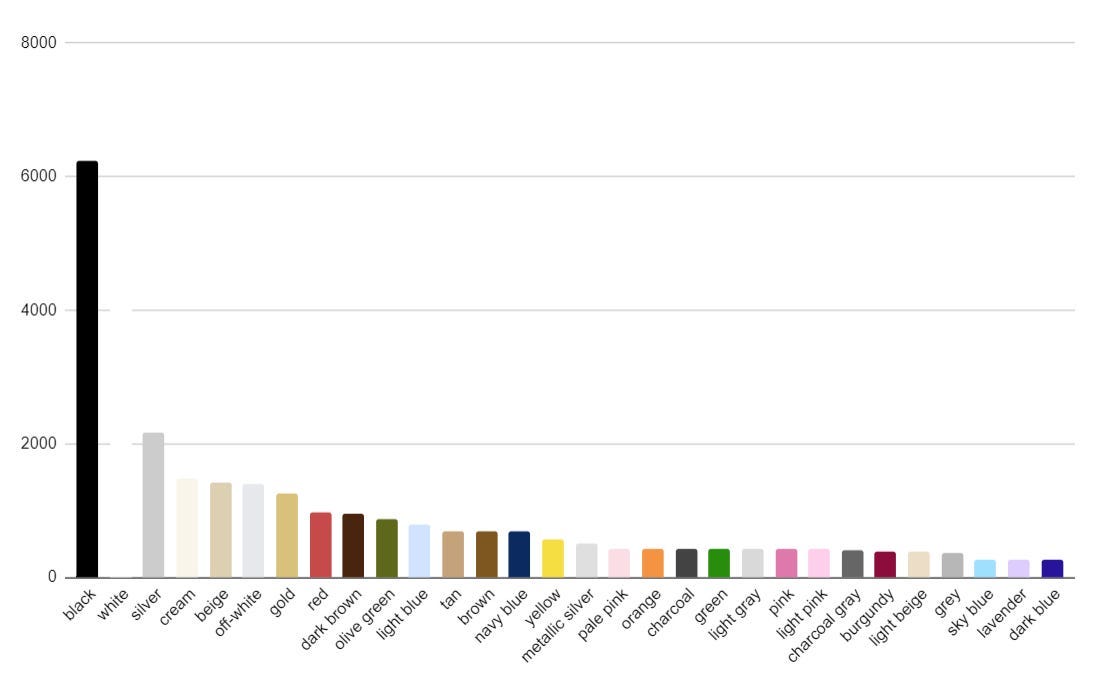
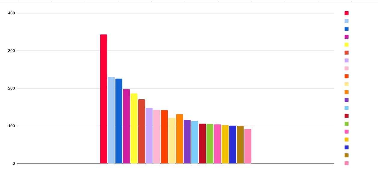
As you can see, the set of most common colors and their ordinal rankings are very similar.
Black, white, and silver are the “top three” in both; the same set of neutrals (gold, dark brown, cream, beige, off-white) fill out slots 4-9, with some rank order shuffling; etc.
The full top-30 lists contain almost exactly the same set of colors. Even the exceptions (“yellow” and “gunmetal gray” being present only in the first list, “metallic gold” and “light grey” being present only in the second) are fairly low in the rankings and are clearly near-synonym effects, as gold and multiple shades of gray are prominent in both lists.
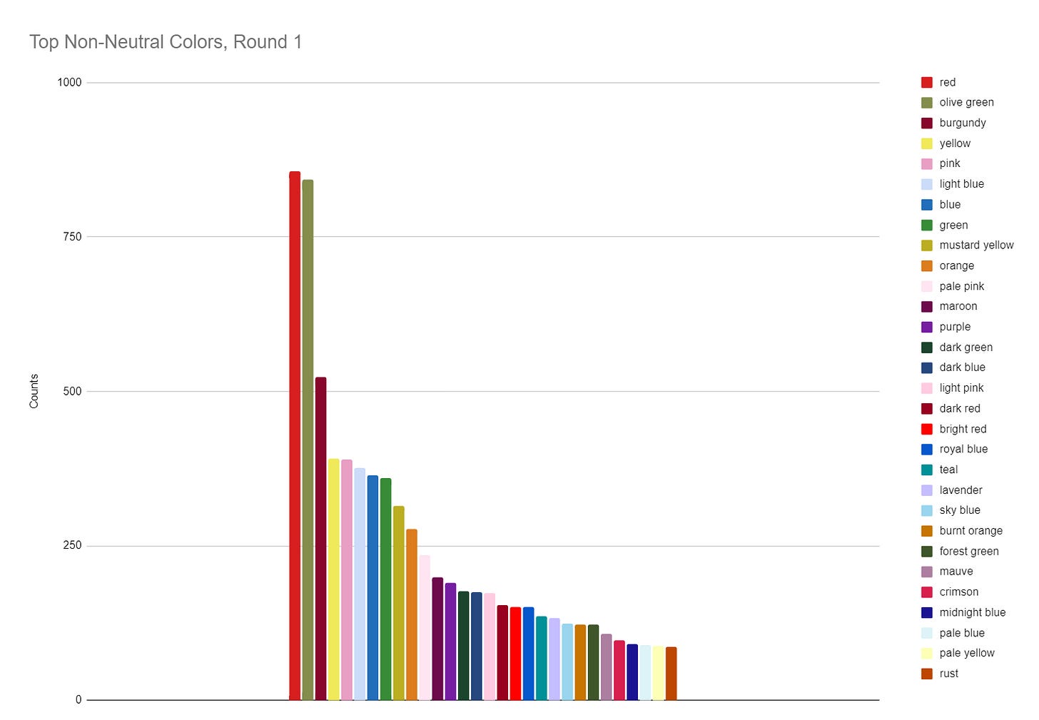
If we restrict attention to non-neutral colors, once again we see substantial similarity between rounds 1 and 2.
The top-3 colors are clearly red, olive green, and burgundy, and the top-30 non-neutral color sets have substantial overlap, with the exceptions being mostly synonym effects (“dark red” vs “deep red”, “midnight blue” vs “dark blue”).
What we see, overall, is a rather dark, autumnal palette. Classic neutrals, punctuated by dark-leaning reds and warm tones (not only “red” but “burgundy”, “maroon”, “dark red”, “deep red”, “rust”, “burnt orange”, “mustard yellow”) along with olive green.
FW24 vs SS24
How are the fall/winter colors different from this year’s spring/summer colors?
There’s a lot of similarity. Black, white, and silver are still at the top, along with other neutrals like cream, beige, off-white, and gold; red and olive green are still high-ranked.
We do, however, see a lot more types of grays and charcoals in the FW24 colors, and higher scores for burgundy and dark brown, while pastels like pale pink, light pink, sky blue, and lavender are off the top-30 altogether in the fall/winter season.
This all makes sense; warm-weather clothes tend to be lighter and brighter, while cold-weather clothes tend more towards the dark and somber.
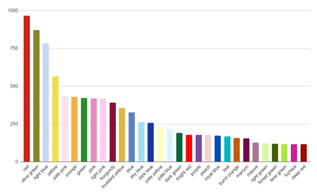
What about the non-neutral colors?
There’s still a fair bit of commonality here — red and olive green at the top, lots of the same colors making it onto all 3 lists.
We see that in the fall/winter collections burgundy has outpaced light blue in the #3 slot, while pastels generally have tended to move down in the rankings. Some SS24 top pastels (peach, light green) and brights (fuchsia, lime green) have disappeared altogether in FW24, while darker colors appear in the FW24 lists that weren’t present in SS24 (deep purple, rust, midnight blue, dark red).
Overall, once again, this makes sense as a seasonal phenomenon — fall colors are typically darker and more muted than spring ones.
FW24 vs Past Fall/Winter Collections
SS24 was my first automatically scored collection, and there are substantial differences between hand-scoring and GPT4-scoring (see this post for details.)
The bottom line is that I’m now confident that these are systematic rather than random effects — GPT4 will consistently read some colors differently than my subjective assessment. (In particular, it seems to have an affection for “olive green”, counting a wide range of shades of green, khaki, and brown as “olive.”)
So comparing FW24 to my past, manually scored stats is a bit of an apples-to-oranges comparison, but I’ll do it anyay.
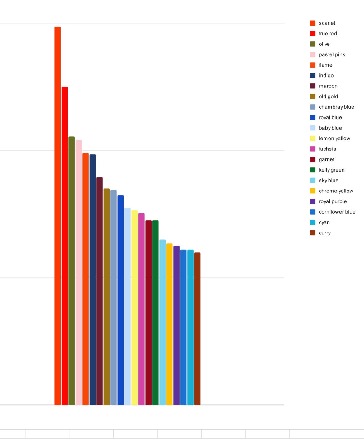
We see a substantial amount of overlap between FW24 and FW23.
Reds and olive green remain at the top, with darker reds (burgundy, maroon, garnet, dark red and deep red) prominent, as well as dark yellows (old gold, mustard), dark blues (indigo, dark blue) and pale blues and pinks.
A substantial difference is that FW23 has a high-ranked bright red-orange (which I called “flame”) and a fairly high-ranked fuchsia. Nothing like that is anywhere near the top in FW24. FW23, in turn, has nothing like FW24’s dark greens or muted autumnal oranges (“burnt orange”, “rust”).
Moving back in time to FW22, we see an even starker shift. Red is still at the top, but olive green and burgundy are totally absent, while bright warm colors like fuchsia, flame orange, tangerine, and hot pink are among the top scores.
Basically, even within fall/winter collections, I think we see evidence of a progressive color shift towards darker and more muted colors, and away from the tropical brights of the beginning of the decade.
Takeaways
Earlier I speculated about this being associated with a shift in cultural mood, away from euphoria and towards restraint and sobriety. These past few years have seen new wars, rising interest rates, and a political rightward turn in the US — could that be translating into more “serious” clothes in more subdued colors?
Or maybe that’s reading too much into it. A shoe designer of my acquaintance says that shifting color trends in fashion have nothing to do with aesthetics or culture and everything to do with the supply and price of pigments and fabrics six months prior. Virginia Postrel, who’s forgotten more about the economics of textiles and fashion than I’ll ever know, dismisses the idea that clothing shoppers buy less in bright colors in economic “hard times”, since “color, like longer hemlines, isn’t a luxury.”1
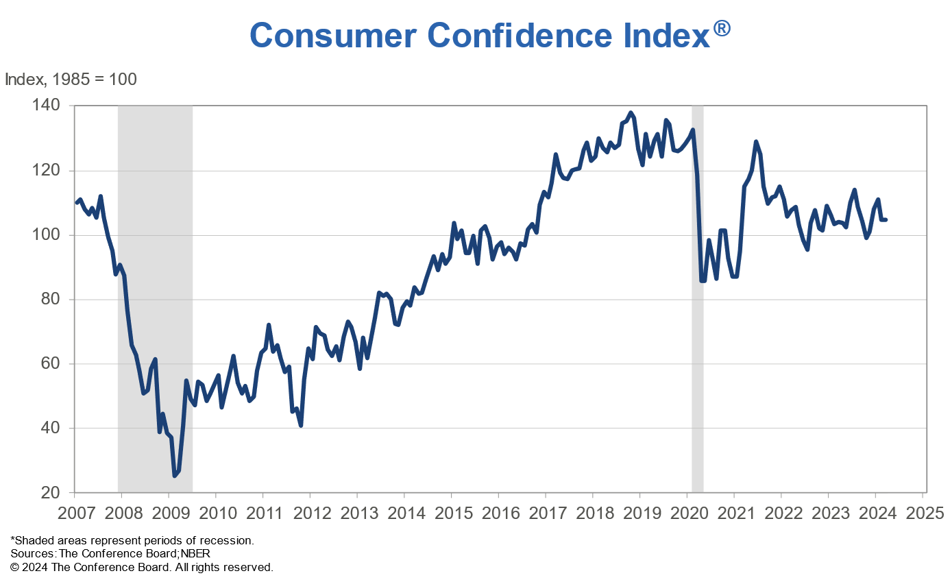
On the other hand, the US Consumer Confidence Index, which is based on questions about business conditions, employment conditions, and family income, does seem to track recent shifts in color trends. There was a post-COVID-19 spike in consumer confidence beginning in early 2021 (when the 2022 collections were coming out) followed by a drop that remained fairly steady from 2022 to the present.
But is this consistent over time or a coincidence? Without more data, I’m not sure.2
Regardless of interpretation, I’m pretty pleased with this season’s color-scoring results; I’m calling this adequate evidence that LLM-automated color-coding is relatively consistent, accurate, and a viable substitute for hand-counting.
I didn’t even bother finishing hand scoring this time around; but I did notice “wow, lots more burgundy and rust this time around” at a few thousand images in (out of 10,000+), and it’s gratifying to see that the full automated stats bear out my subjective impressions.
Maybe one of these days I’ll clean up the code and make this a proper web app!
I’m a bit skeptical of the claim that “color isn’t a luxury”. Yes, in the age of industrially produced dyes, colorful clothes don’t cost any more than basic black ones; but colorful clothes are harder to fit into a wardrobe, since they “go with” fewer other things and are appropriate to fewer occasions. Arguably clothes one rarely wears are luxuries that consumers would cut back on when they feel poorer, right? Also, unusual colors are higher variance in popularity than basic neutrals, so wouldn’t one expect fashion design brands to be more risk-averse and shift towards perennial favorites in years when they don’t expect to be able to weather a season of commercial failure?
Were bright colors less common shortly after the 2008 crash? Did they become more popular through the 2010s? This is checkable, I just haven’t done it yet.







I would buy the app😊
But then, I used to be a designer in the industry, so in this, I'm as biased as they come😉
Odd colors or patterns that don't go with anything are a luxury but bright odd colors are more common in cheap synthetic fabrics so if the economy tanked it's possible that color diversity would go up when everyone bought polyester from Shein.
I don't know if GPT can recognize material but I bet colorful pricey material is bullish and drab synthetics are a sell signal